Analytics on apples and oranges: Comparing sports

I was an exercise logger long before I had heard the word “analytics.” I became a semi-serious recreational runner in 1996, and after a few months of paper logs, I’ve kept track of my running digitally. Early on, I used one of the first log apps, The Athlete’s Diary (which still appears to exist!), then for many years a modified Excel template created by a couple of people from the Dead Runners Society. Since switching to GPS watches, I’ve used a bunch. Currently I use and like Garmin Connect and Strava, as I wrote last week.

The analytics these new tools provide are impressive. But running is, in lots of ways, easy to be analytical on: There’s time and distance, and therefore speed. There’s effort, for which a heart rate is a pretty great proxy. Add terrain (from GPS or your own logging), cadence (from your watch’s accelerometer), and you can analyze and compare almost everything you do.

But what if you do different sports? Or, worse yet, sports that are very complex. When “constantly varied” is in the definition of a sport, as it is for CrossFit, my preferred version of “functional fitness,” you know it’s not going to be easy to figure out how one workout relates to another. What’s a boy to do? Continue reading

Segments Rock! The Value of Virtual Competitions

There’s a guy who lives in my neighborhood. I think he lives here. I haven’t met him and I don’t yet know him even in the virtual way you can get to know people on listservs (remember those?) or social media.

The segment in question.

The segment in question.

So I’m not exactly yet trash talking him. But we’re close to trash talking. See, we are competitors. We are trying to figure out who runs faster on a Bird Hills trail from Newport Road to Bird Road. A couple of weeks ago, I got third overall, then he beat me on it, and this week I did my best to beat him and get back the bronze medal. I succeeded! Take that, French guy! How’s your Maginot Line holding up now? Huh? (I think he’s French. I don’t know. I have nothing against the French, but if we’re competing, we might as well get nationalist about it. I can’t imagine a running event where the Finns don’t beat the French.)

You might be puzzled about how I can compete — continuously — against someone I’ve never met. It’s easy: it’s a virtual competition. It’s a virtual competition made possible by Strava, an endurance sport logging tool. Strava is like a bunch of other cloud-based exercise logging services and just one of the many I use. (To get technical about this: I log my runs with my Garmin GPS watch, which uploads my runs to Garmin’s Strava counterpart, Garmin Connect, which kindly transfers my data over to Strava.) Strava is fantastic because of the incredibly rich analytics I get for my runs and occasional bike rides. But what really has reinvigorated my running are Strava’s segments.

Segments are bits of a route that someone decides to tag as benchmarks tests, usually just for themselves, but, given the nature of these cloud-based tools, for others as well. If the segment you created is an area where other people go, they’ll get the info about it when they log their workout on the site in question. And thus begins a virtual competition.

Or does it? For me, yes, with qualifications. But for others, according to my anecdata, definitely not. In fact, my colleagues in psychology have a reasonable explanation for this: rivalry increases among people with similar performances when they are ranked near the top, and decreases when the chance of getting the gold, or the bronze, or any meaningful recognition diminishes. If you are ranked 200 in something, you are not particularly excited about beating 199, the story suggests, with pretty compelling results.

So on this particular segment, since we’re talking about the third best time, I’m pretty darned interested in keeping my (maybe) neighbor/the French dude, away from the prize. On many other segments, where I’m nowhere near the top — Ann Arbor has some seriously fast runners — I don’t care if I’m number 65 or 265. Whatevs, I say on those segments.

What’s really cool about Strava (and probably about other such tools) is that you can make the competition meaningful. Individuals enter parameters about themselves into the system, and you can drill down and limit the pool to the people who share your parameters, whether it’s age, weight, gender, or some combination.

Strava_Segment___Bird-Hills_Newport_Entrance_to_Bird_road

I now have bronze on the segment and, dammit!, will keep it.

Sure, the parameters are limited, and there’s no way everyone can make themselves feel that they are competitive. But given the pursuits available, there might be. Not a runner? Try weightlifting. Or target shooting. Or walking. Or knitting. Or chess.

Does this mean that I want to endorse the creepy idea that “Everyone is special”? No. But if we do think, as we should, that for some people, meaningful competition can become a source of motivation to push beyond their current limits, then we should think about how to create them. I mean, there is nothing intrinsically valuable about the Newport Road-Bird Road segment, but given the people who’ve run it, it makes me push harder, and run more.

This blog, despite its name, is motivated by (a) my interest in teaching better and (b) that competition does not belong in education. So this post might seem like a weird anomaly. But the fact is that we have students who are motivated by competition. This, I hope, helps us think of ways in which we can tap into that motivation for more than the usual suspects while also not alienating those for whom all of this still remains creepy.

So, for now, my eye is on this guy from my neighborhood, and whatever segments he chooses to run.

Competitiveness and the Problem of Grading

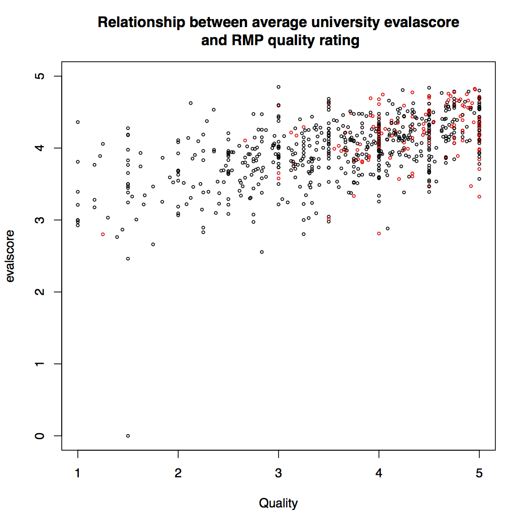
Back in the 1990s, I used to do a noncompetitive martial art. It was so much fun that I almost dropped out of grad school to become an instructor. It also had its unfun aspects, which is why I’m not doing it anymore. What I want to talk about here is the noncompetitive aspect. What do you think was the effect of this egalitarian, non-selfish aspect? At our school, at least, among the serious practitioners, at least, everything became a competition. Not only did everyone compete on the mat, in every practice (“Ha, bastard, let me show you how much better my technique is!” “No, loser, it’s not about technique but about whether I can throw you. Watch!”) but off the mat, too (“Jack is not as loyal to the chief instructor as Jill.”).

After I quit the martial art, I started running competitively. I loooved racing. It turned out I was relatively good, so I would place pretty well in smaller races or in the age groups of bigger ones. That’s a great discovery when you grew up as a non-athletic klutz. I also liked competition. But the most interesting fact was that, among my training buddies, there was none of that creepy competitiveness my martial arts school had had. Except for the occasional macho jackass who didn’t know the difference between races and training, we trained hard but totally noncompetitively. After all, we had the actual races to see who could do what.

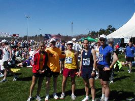
The author in Hopkington with some friends, before his fifth Boston Marathon.

It was also interesting to notice that the jackasses for whom every practice was a race actually didn’t do so well.

Being competitive is good in some instances and not so good at others. This is familiar to all athletes who have reflected on their practice. You can also draw a broader theoretical observation: the rules with which an institution operates might foster the behaviors it values and wants to promote — or do the very opposite. A competitive sport helped foster a collaborative training practice for me and my friends, which improved everyone’s performance. A vague ideology of noncompetition in the martial art helped foster insidious competition in which sniping, griping, and back-biting flourished and progress was random.

* * *

The first reading in my Introduction to Political Theory is a cool essay by Louis Menand on the purpose of college. Although it’s not formally a piece of political theory, it works like one: it takes a step back from a familiar institution — American higher education in this case — and explores theoretically the goals and values that institution tries to foster. One of Menand’s points is that, since 1945, American higher education has embraced two very different theories, meritocracy (use college as a sorting mechanism to identify the talented, the mediocre, and the untalented) and democracy (make sure all graduates have the skills and talents democratic citizenship requires).

Menand doesn’t spend very much time on what kinds of behaviors higher education fosters internally. This is not a complaint; it’s not a central part of his argument. But it is related, so it’s worth asking questions about one of the most importance incentive mechanisms of education: grading.

Educational institutions don’t, for the most part, explicitly aim at competition between students. But depending on their assessment systems, some implicitly do. The most obvious case is ranking, which is still frequently done in law schools. It’s not surprising. Law schools are a kind of a pedagogical North Korea (totally backward, but in a cheerful denial about it): their use of one-time, high-stakes instruments for assessment and the Socratic Method already prove that. The ranking approach is the most insidious one, as it creates incentives not only to compete with your peers, but to actively hurt them. Come to Law School — We’ll turn you into pedagogical Tonya Hardings!

But law schools aren’t the only offenders. Even something like grading on a curve can foster perversely competitive tendencies — while simultaneously demotivating effort at learning. Now “grading on a curve” can mean a couple of different things. It can simply mean setting the median grade in an assessment instrument, but not really caring about what the distribution should be. Or it can mean making sure the shape of the resulting distribution is that familiar bell-shape.

Is this the distribution of your students? In every class? Every section? Regardless of where you teach? Amazing!

Or other related things. The problem with each of those is that it either (a) assumes students in a class are always, for the most part, just like students in another iteration of the class or (b) insists that, regardless of what the students in a course are like, their final outcome should make them look like students in other iterations of the course. In other words, (a) you’ll always think you have some really weak students, some really strong students, and lots of middle-of-the-road students or (b) you think that no matter what the distribution of talent in your course, they should look like a random sample of few weak, few strong, and lots of middling types. I’ll admit, sure, it’s possible students are similar, but you’ll need data independent of your assessment instrument to show it. Good luck with that! It can be done, but I’ll bet dollars to donuts most of the folks who grade on a curve haven’t done their homework on this. So, on either option, it seems ill-motivated.

And meanwhile, students have incentives to compete, in the bad way I experienced in my martial arts school. If the median is set beforehand, making sure others do worse than you will help you. And if the course insists on a normal distribution, it sends a totally perverse signal to everyone that everyone aspiring to do their best and actually doing well is impossible. Should it be?

The Missing Chili Pepper, Part 2

Back in June, I reported on the observation David Cottrell and I made that on RateMyProfessors.com (RMP), having a chili pepper makes a difference. The chili pepper, recall, is RMP’s way of indicating that at least third of your raters think you are “hot,” whatever that means.

Here’s an updated version of that earlier result:

The relationship between easiness and professor quality conditional on hotness.

The relationship between easiness and professor quality conditional on hotness.

What this updated visual tells us better than our earlier one is that the effect is not linear. For instructors rated not “hot,” the quality increase as their easiness increases is significantly greater than for “hot” professors, especially at the hardest end.

I wondered at the end of the earlier post on whether we might see a difference conditional on instructor “hotness” in the official University of Michigan evaluations, which of course don’t ask anything about hotness. We now have the answer: weeeell…. sort of, with grains of salt and lots of qualifications.

Here’s what we did. We took our dataset of all UM evaluations for the College of Engineering and the College of Letters, Sciences, and the Arts from Fall 2008 to Winter 2013. That’s about 10,000 instructors, including professors, lecturers, and graduate student instructors. Our RMP data has 3,100 instructors, again of all varieties. We were only able to match 715 instructors in these two sets, largely because instructor names are in different formats — and rely on student spelling skills on RMP. (I admit I have a particularly hard name, but I’ve yet to see all my students get it right, and this does seem like a common problem.)

So, with 715 observations, there’s not much we can say, and the data are not conclusive. Here’s the best thing to show:

The relationship between instructor quality on RMP and "excellence" on UM evaluations.

The relationship between instructor quality on RMP and “excellence” on UM evaluations.

On the x axis is an instructor’s quality rating on RMP, on the y axis is his or her median response to the statement “Overall, this is an excellent instructor” (with 0 as “strongly disagree” and 5 as “strongly agree”). The red circles represent instructors who have chili peppers on RMP, the black ones those who don’t. This data doesn’t have instructors not on RMP.

There is a small positive correlation between RMP and Michigan’s own evaluations, which is good news for RMP (and to be expected.) “Hot” instructors are to the high ends of both scales. But there are also plenty of “not hot” instructors with high ratings.

This is what we feel comfortable concluding: if you tell me that you have a chili pepper on RMP, I can tell you it’s more likely than not that you are highly rated on both RMP and in the official evals. The opposite is not true: if you say you don’t have a chili pepper, I can’t tell you anything about your other ratings. And, of course, most University of Michigan instructors are not on RMP at all.

Still, seeing the “chili pepper” difference in our data takes us back to the question of what it might be measuring. I won’t repeat the speculations of the earlier post, but offer a few more. First, maybe it is about looks, after all, as Daniel Hamermersh and Amy Parker’s fantastically titled 2005 paper, “Beauty in the Classroom: Instructors’ Pulchritude and Putative Pedagogical Productivity,” suggests. Looks make a difference for professionals’ earnings, so why not for instructors’ ratings? Another, less depressing and creepy conclusion is that the chili pepper is measuring what psychologist Joseph Lowman has called instructors’ “interpersonal rapport”: positive attitude toward students, democratic leadership style, and predictability.

Of course, those two don’t have to be mutually inclusive: for a few students, the chili pepper may just be a report on how attractive they perceive the instructor to be while for others, as our anecdotal evidence suggests, it may be a measure of positive rapport. Either way, it’s too bad that RateMyProfessors.com has to frame the issue like a horny eighteen-year-old frat guy.

Working hard, and harder. Maybe. How would we know?

This post is inspired by two things. First, according to a recent study by Magna Publications, half of academics report that they work harder than they did five years ago. I have no bone to pick with Magna, which produces the very helpful Faculty Focus articles on teaching in higher education. And their survey approach is not unusual. I have filled a few surveys of the kind they seem to have used, by perfectly competent and reasonable people. In fact, one could argue it’s thanks to surveys like theirs that we’ve made a lot of progress in finding systematic discrepancies in faculty lives, among genders and races, for example. But asking people if they “think” or “feel” they are working harder than five years is to invite all sorts of problems. It’s well known we are pretty bad at evaluating the past (or the future) reliably.

The second inspiration comes from a blog post by Steven Wolfram, the creator of Mathematica and a precursor of the “quantified self” movement. Wolfram had tracked his email traffic since 1989 and decided to do a bunch of analyses on his work patterns, overall busyness, and the like.

For a modern white-collar worker, not just Wolfram, email is likely a reasonable proxy for how busy he or she is. I’m sure there is variance between professions (how effing backward can physicians really be on modern communication tools?) and individuals (I am pretty anal at replying to all email sent directly to me, usually within a few hours). For academics, I would argue, the email we send is a good indicator of work, especially of the “how busy am I?” dimension. (Nobody ever says, “I was so friggin’ busy today: I got to work on my article all day without any interruptions.”)

Wolfram’s analyses were cool (to me, at least) and possibly creepy (to many of you), but it inspired me to try something similar. I have used email since 1987, but I’ve only tracked it regularly since 1998. Unfortunately, due to data incompatibilities (and an unfortunate detour to Microsoft products), I have a solid record only since 2004. Even that record has some problems, but before I discuss them, let’s look at the data:

Sent mail 2004-2013

Monthly sent mail totals.

Here’s how many emails I sent each month. The total is is 24, 861 message between late 2004 and last week. The highest month is 641 messages. You’ll notice a couple of things right away:

  • There are gaps in 2007. That’s just missing data; my record-keeping system has been imperfect. (That’s when I got tenure, but I did not stop using email. I was probably just more careless about my quarterly archiving.)
  • 2011 seems awfully light. What happened? What happened was that I messed the setting on my laptop, so that my sent mail on that computer didn’t get tracked. For 2011, all you see are the messages I sent from my office computer.

So that little technical snafu makes it kind of pointless to do descriptive statistics such as daily or monthly averages and standard deviations. (I have them if you want, though.) But you can eyeball the data: summers are obviously lighter, and my sabbatical, academic year 2008-2009, is also lighter, but not dead. There is a slight upward trend, but the most noticeable thing are the whopper months, especially after tenure. So if I had to fill out a survey that asks, “Are you busier now than you were five years ago,” the crunch of February through April (I was grad admissions director, so it was busy) might loom large, and I might say, “Yes!” even though it’s not that much worse.

See, if I look my daily email habits, following Wolfram, I see pretty much the same pattern: I send emails all of my waking hours:

Distribution of sent email, 2004-2013

Daily email sending practices, by time of day.

On the x axis here are individual days, on the y axis is the time of day when the message was sent. (Each dot is a message.) I have not pulled an all-nighter since my first year of grad school; the seeming night-time messages are from travels in different time zones. Now you see that, indeed, around 2011 I only kept messages sent from my office machine. I work through the day, but I only go to the office during bourgeois working hours.

The key point I want to make, though, is that even with its gaps, this data is better than a rough sense of how I might feel. Of course, I don’t want to generalize from my experience to that of any other academic. So, on what basis do you say you are busier now than you were five years ago?

Nerd section:

How did I get the data? I’ve archived all my email; the post-2004 email was all on Apple Mail. I used an Applescript script to scrape all those almost 25,000 messages into a CSV file, with time stamps, and then I played with R to analyze it. Thanks to Cait Holman and David Cottrell for help with the technical stuff.

The Missing Chili Pepper, Part 1

In a conversation about RateMyProfessors.com, a colleague once yelled (after a few drinks), “I don’t care about the rating. All I want is the chili pepper!” Well, it turns out that if you get the chili pepper, you are more likely to have a good rating, too.

RateMyProfessors.com, or RMP, is a crowdsourced college instructor rating system that our colleagues generally hate, ignore, or know nothing about. There are reasons to be critical of it: It’s anonymous (so people can vent and be mean — or not even be students in your course). Its response rates are spotty and generally bimodal (most instructors have no rating,  and mainly it’s only those who like you or hate you bother to rate you). And some of the variables RMP cares about are not conducive to good learning: you can be rated on “easiness,” and, most problematically, students can decide whether you are “hot” by giving you a chili pepper. Why should anyone care about that? Why should they be paying attention to the way you look, for cryin’ out loud?

OK, so it’s not great. But there are things to say in favor of RMP, too. It doesn’t only track problematic things such as easiness or the professor’s perceived hotness. It asks about the professor’s clarity and helpfulness, too. A professor’s score on those items in fact constitutes his or her overall “quality” score. Professor quality simply is the average of his or her clarity and helpfulness scores.

Also, for better or for worse, in many places, such as at the University of Michigan, RMP is the only thing students have to evaluate instructor quality. At Michigan, we do not make our own, official teaching evaluation results available to the students. (We are hoping to change that. Stay tuned.) And despite the things some faculty say about students, they are not stupid. Talking to students about their use of RMP tells me that students are pretty good at understanding the ways in which the tool is imperfect.

But let’s return to that chili pepper. I am heading a project that looks at how we evaluate teaching at the University of Michigan. I have the luxury of working with a talented grad student, David Cottrell, who is doing wonderful things with data analysis. Among other things, he scraped  all UM instructors’ ratings from RMP (all 31,000 of them, for more than 3,000 instructors). Below is an interesting chart (click on the image for full size):

hotVnot

In case you don’t want to look at it carefully, let me summarize the details. On the x-axis is an instructor’s easiness score; on the y-axis the “Professor quality.” The red line represents those professors rated “hot” (which means that at least one third of their raters gave them the chili pepper). The blue line represents those instructors who didn’t receive a chili pepper.

Some observations:

  • There is some correlation between an instructor’s perceived easiness and his or her overall quality, but not strict. In other words, quality doesn’t just track easiness. RMP isn’t just a tracker for an easy A.
  • There is a stronger correlation between easiness and quality for instructors who don’t have the chili pepper.
  • So, most disturbingly, if you are not seen as hot, you have to be almost as “easy” as the “hardest” “hot” professor to get the same quality rating as that hardass!

In other words: there is a very significant rating penalty for instructors who do not receive a chili pepper.

A bunch of interesting — and troubling — issues arise. What does the chili pepper actually track? Whereas the other RMP measures are scales, the chili pepper is just a yes-no variable. What leads a student to give an instructor a chili pepper? Let’s assume, first, it is all about “hotness,” that is, some kind of sexual/sexualized desirability. Does that mean that only those students for whom the instructor is in the possible realm of sexual objects are even considering it: women for hetero men, men for hetero women, women for lesbian women, men for gay men, and so on? (My hunch is no — we aren’t all metrosexuals, but lots of people are able to talk about attractiveness beyond personal preferences.)

But I have a hunch that the chili pepper tracks something beyond a purely creepy sexual attraction. In fact, I think it might be another measure of the student liking the instructor. It’s not perfectly correlated, but as the chart shows, there is a correlation. It’s still very disturbing — and interesting — if students sexualize or objectify their appreciation for an instructor, at least when invited to do so in such terms.

Please do not suggest that the easy solution to these questions is for me and David to go through all those 3,000 instructors’ websites and see if they are actually hot. Whatever that might mean. But do suggest ways of thinking about the data. We are interested, really.

And in case you wonder why this post is called part 1: we will be able to see whether the chili pepper effect gets replicated in the evaluation data that the University of Michigan collects — and which certainly asks no questions about the instructor’s hotness.